PROJECT SHOLAYIDÉ
LOCATION New York, NY
YEAR 2024
Problem
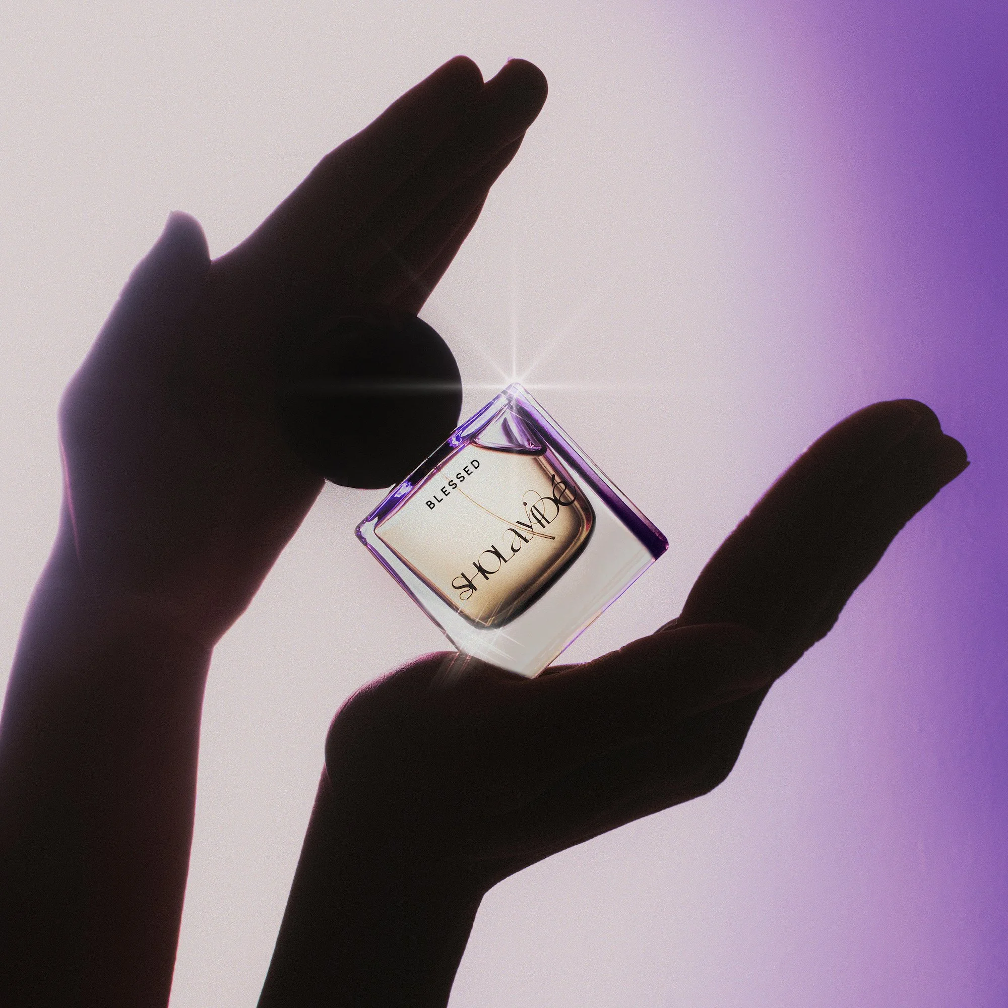
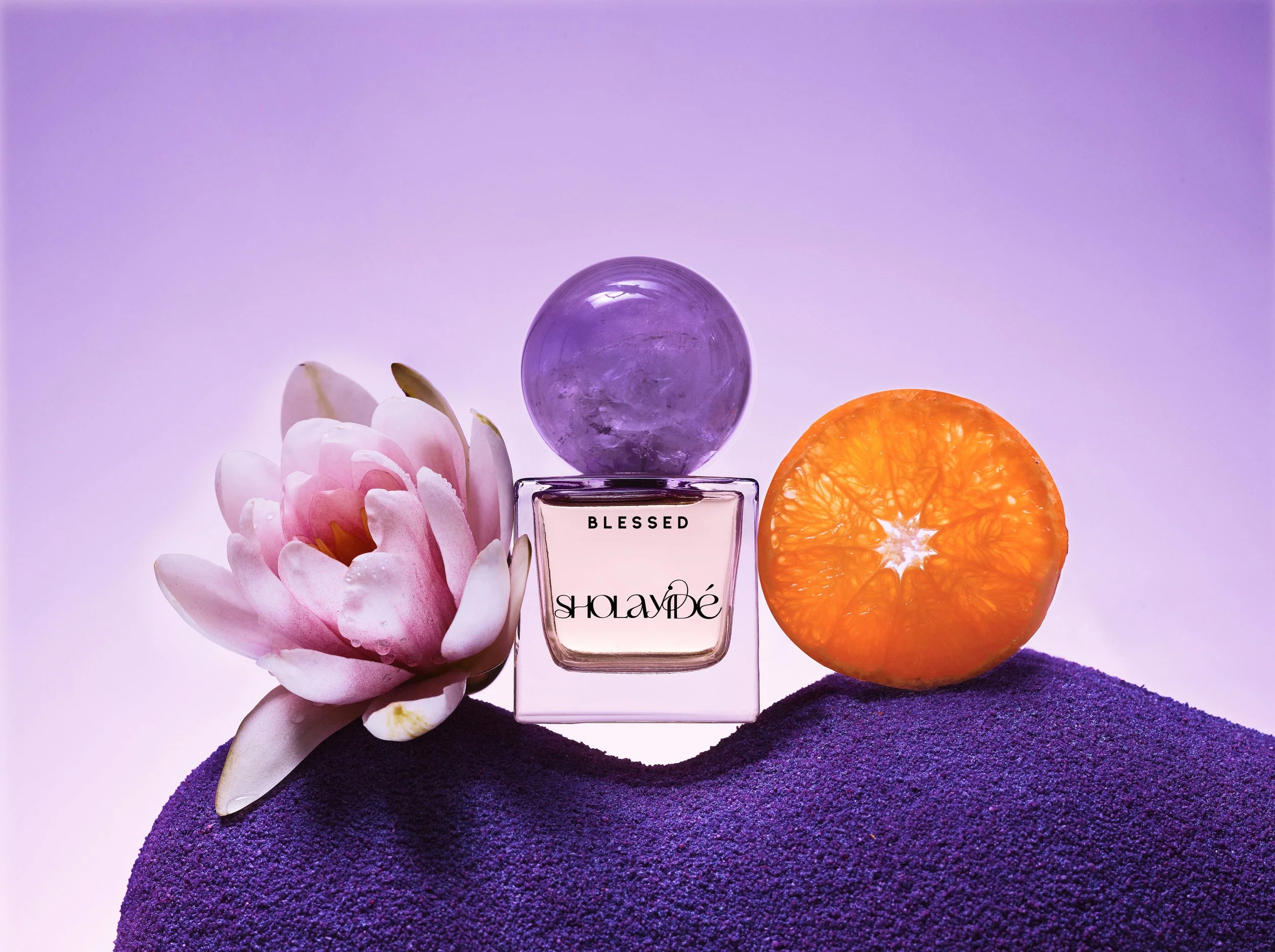
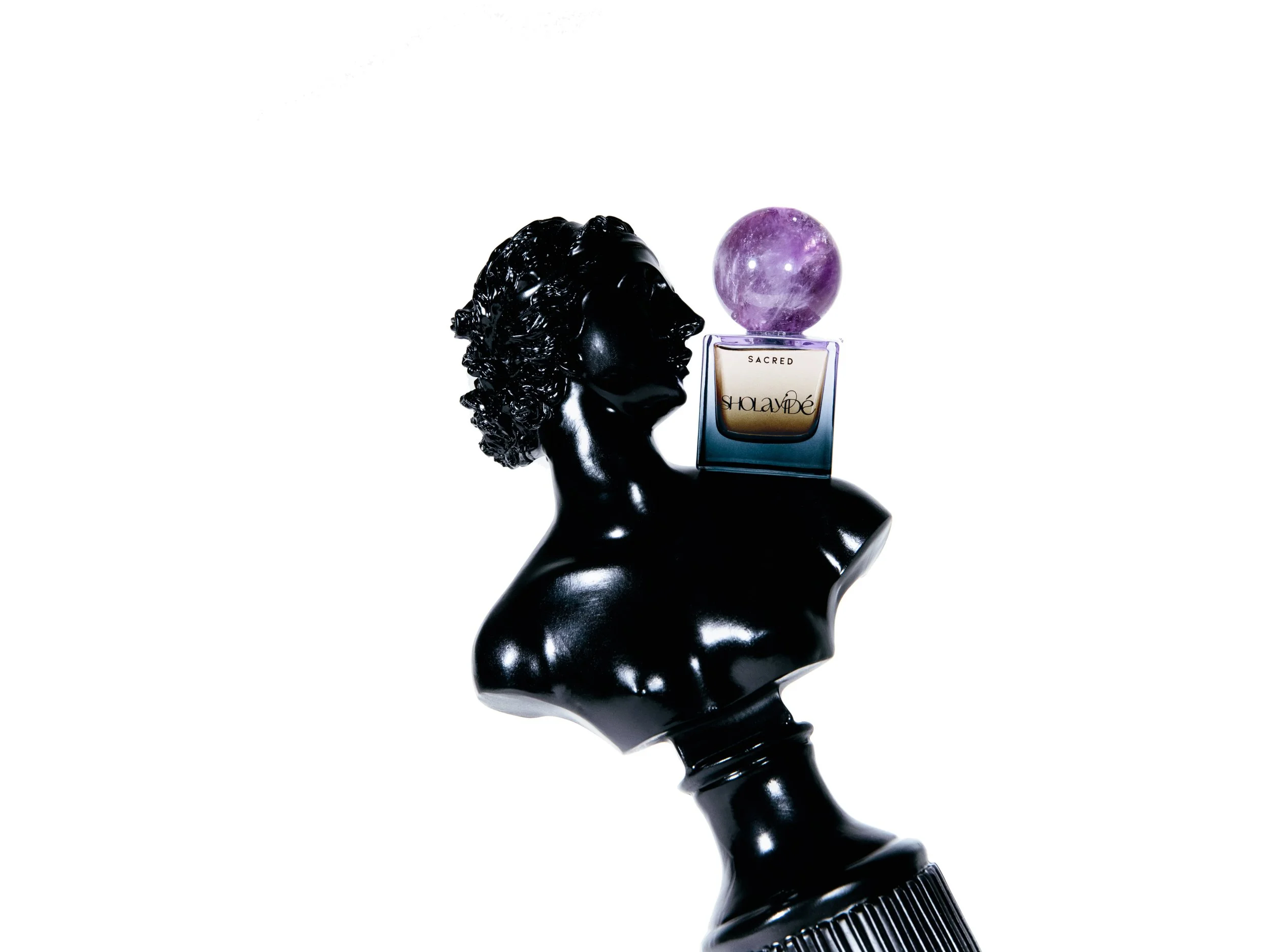
Sholayide entered a highly saturated fragrance market with a concept rooted in spirituality—an approach that risked being either too niche or too abstract for broader appeal. The challenge was to translate the symbolic and emotional qualities of amethyst and spiritual healing into a visual identity that felt both elevated and accessible.
The brand required a clear positioning that could bridge the gap between meaning and modern luxury—without diluting its essence.
Solution
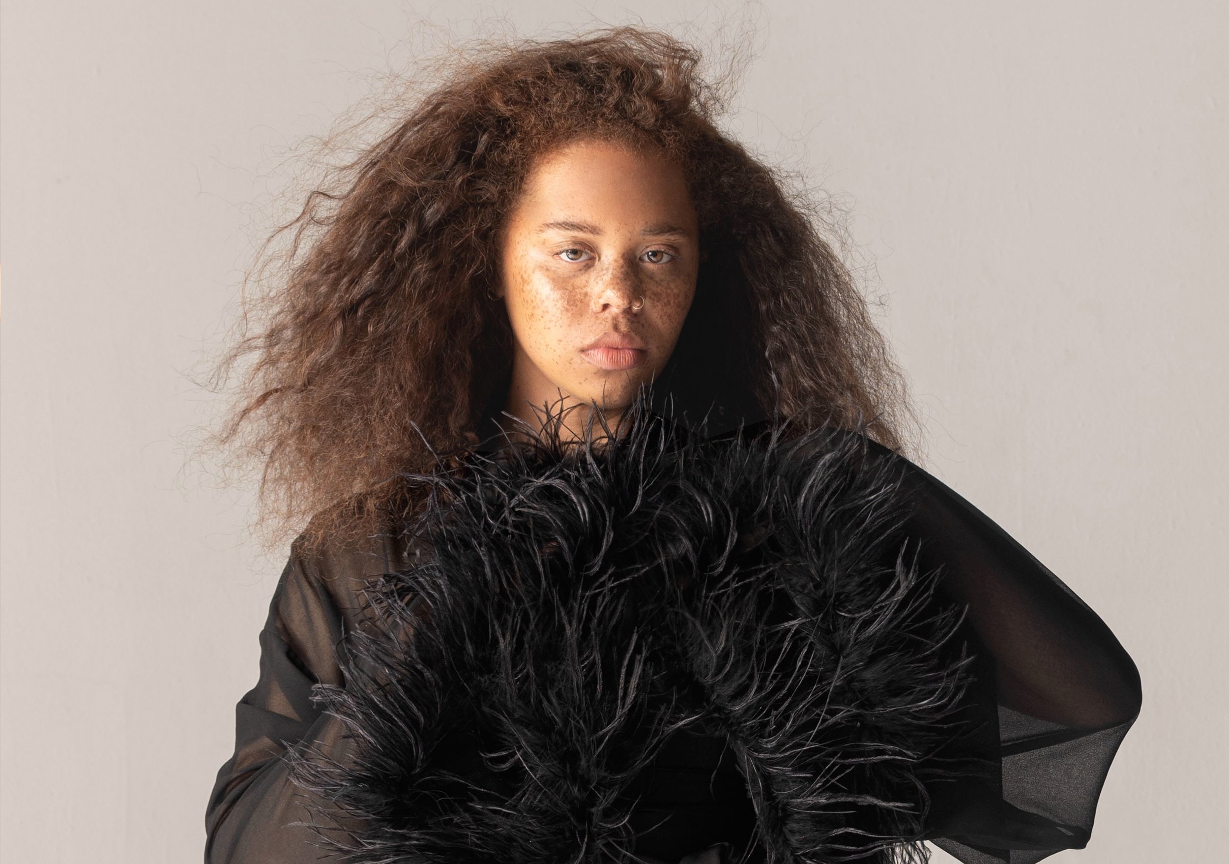
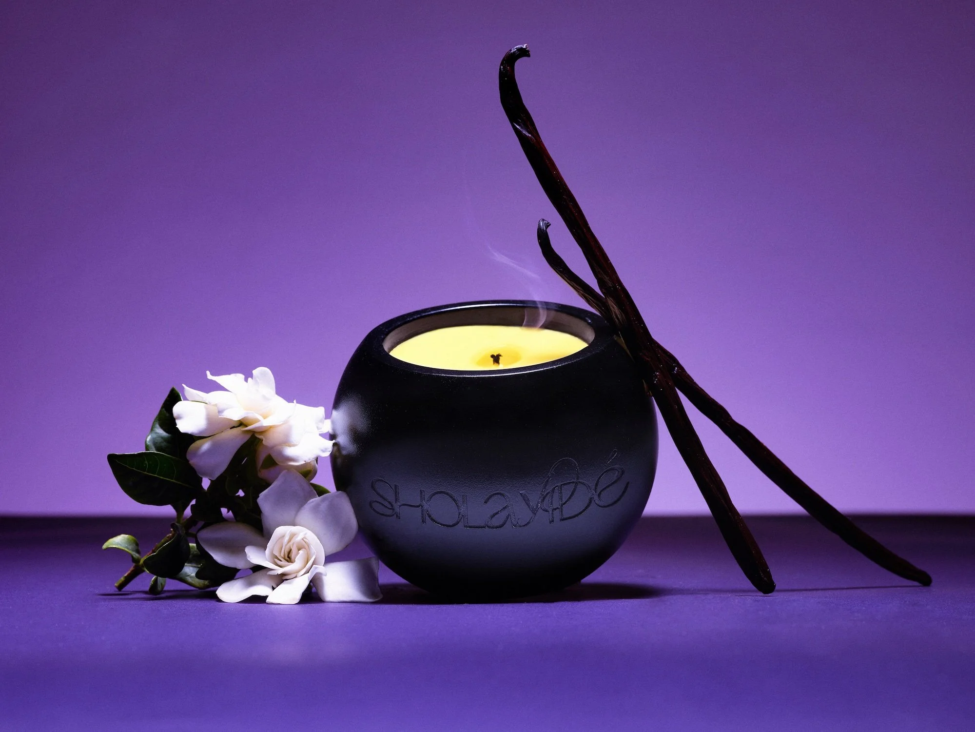
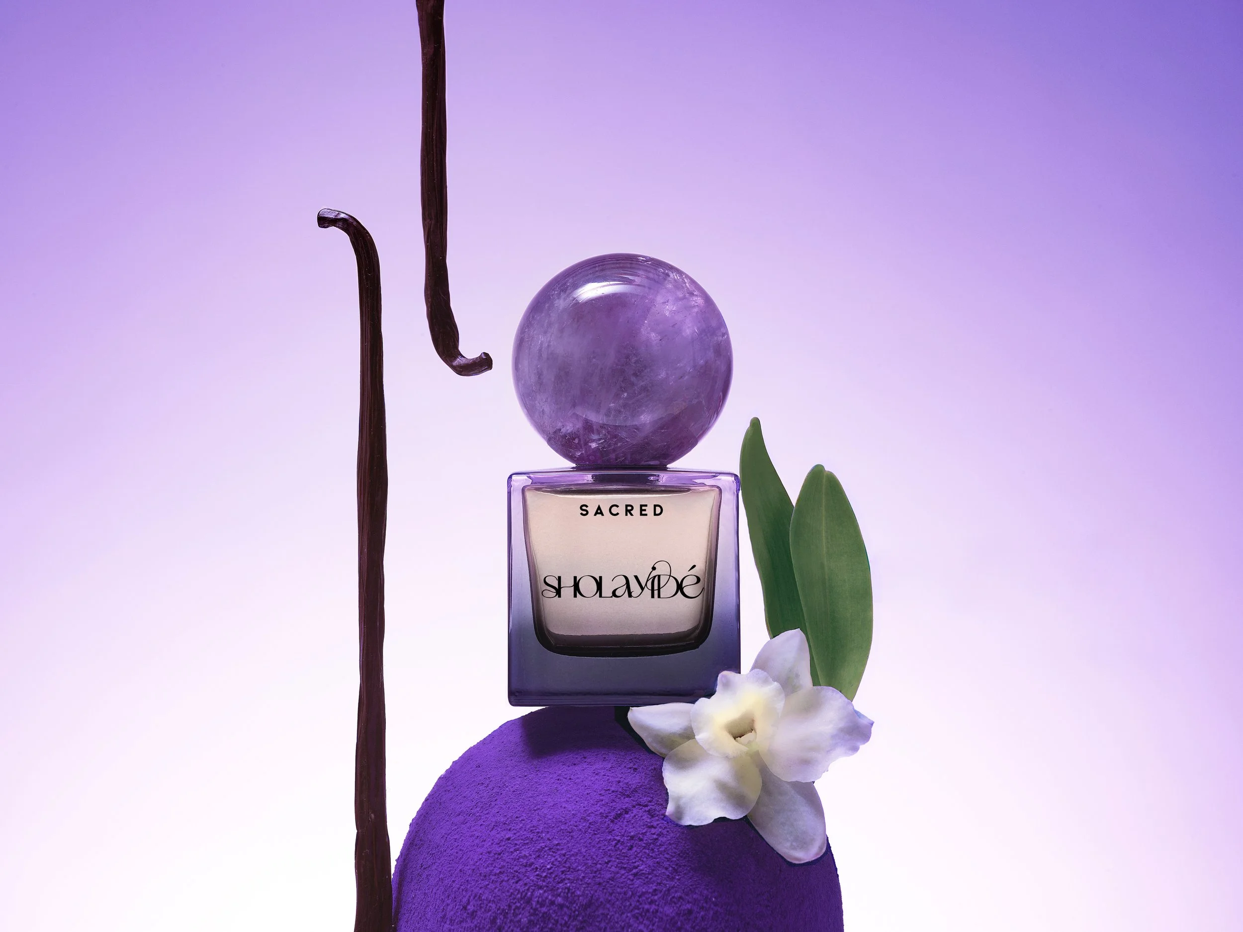
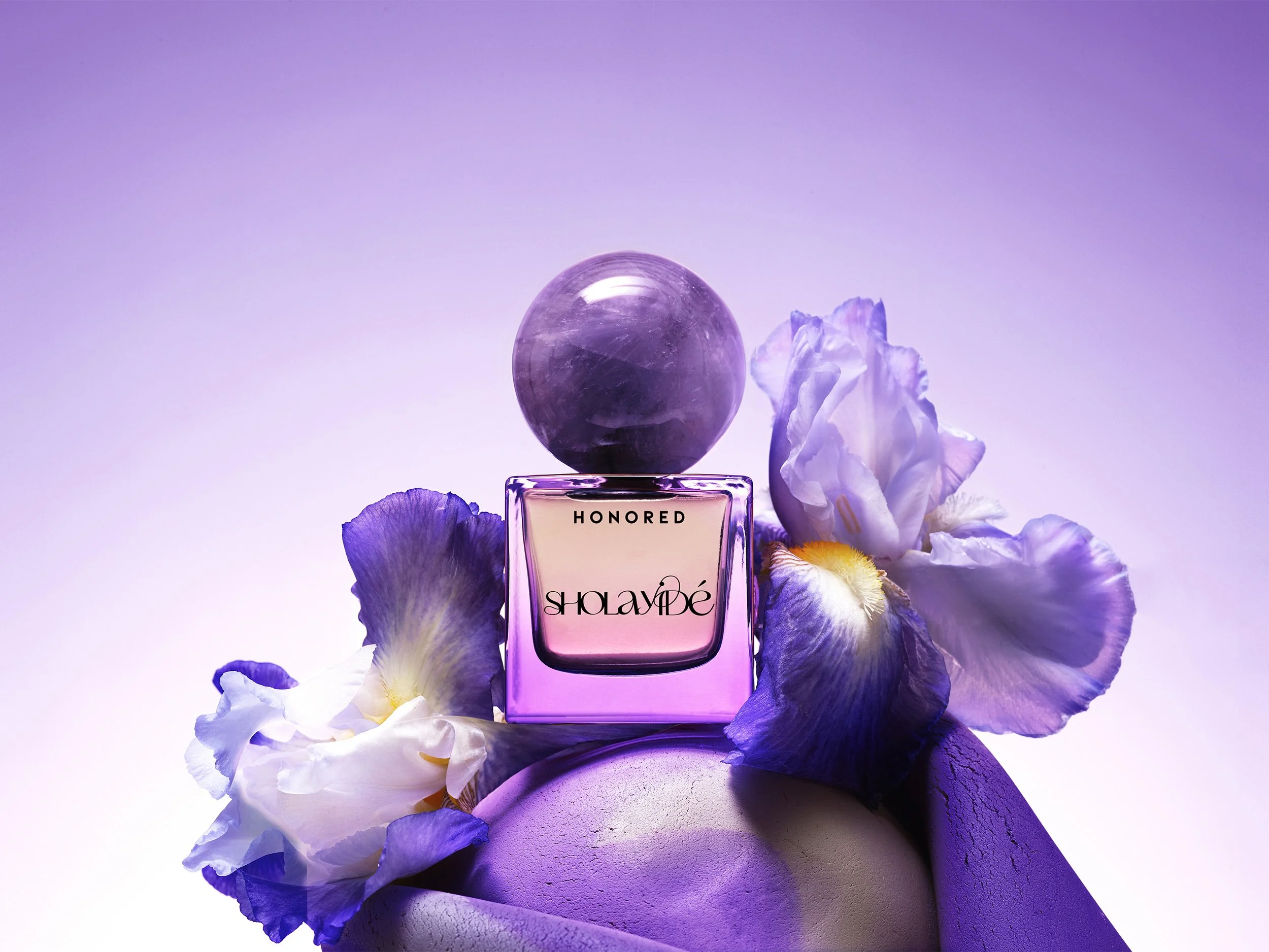
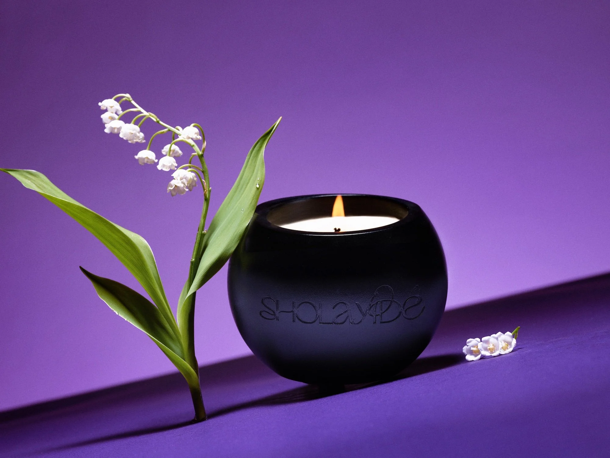
We developed a visual identity that draws directly from the energy and symbolism of amethyst, using tone, color, and form to create a cohesive narrative. A refined purple palette was introduced—not as trend, but as a deliberate reference—while the logo and visual system were designed to feel both grounded and luminous.
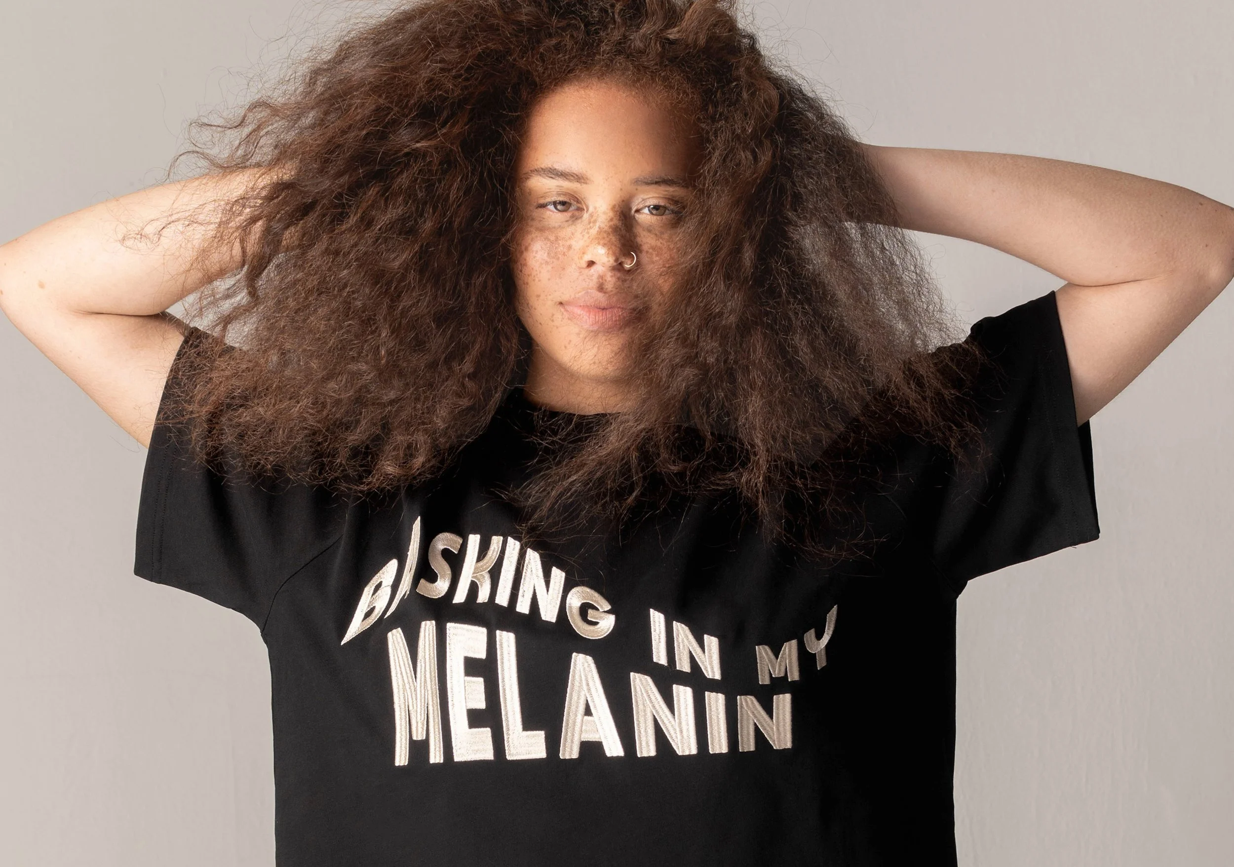
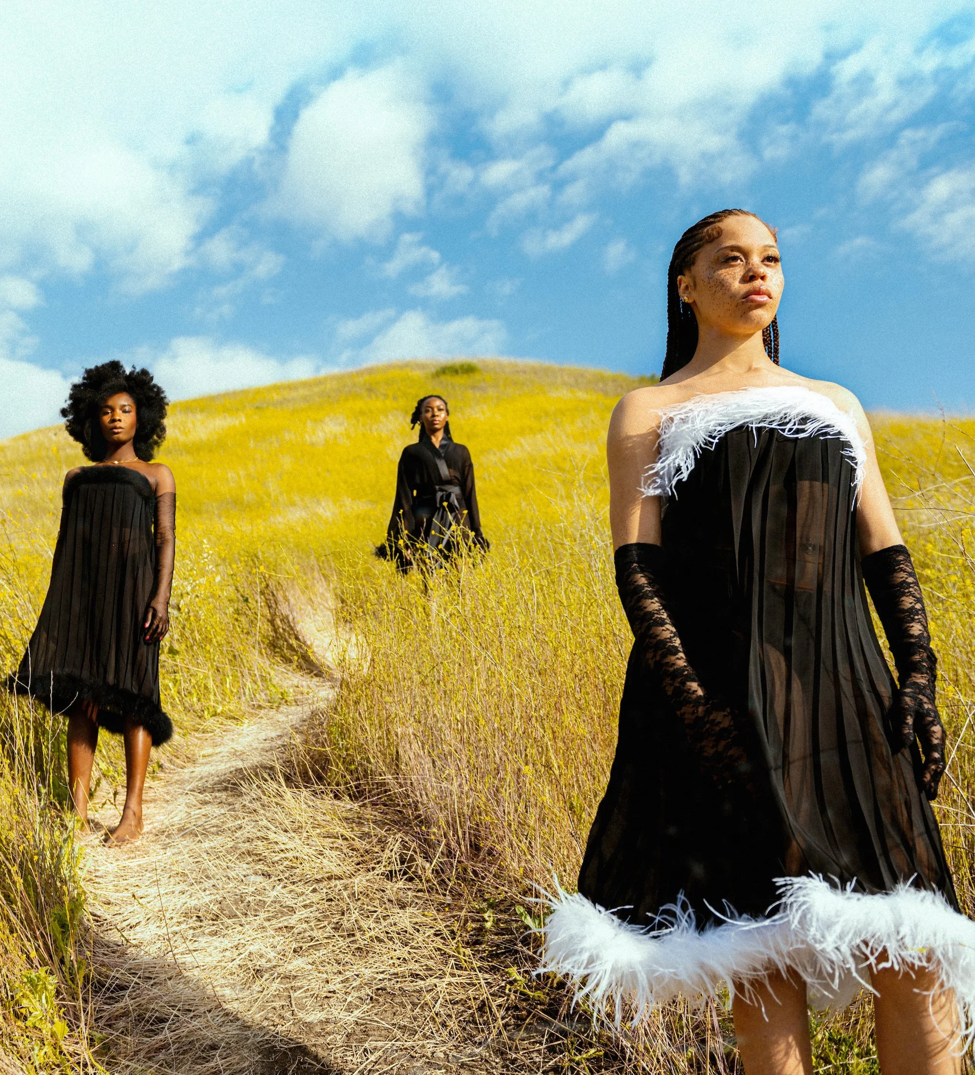
The brand language extended across packaging and digital presence, ensuring that every touchpoint communicated the same sense of intention, clarity, and quiet power.
Outcome
Sholayide emerged with a distinct and memorable identity that stands apart within the fragrance space. The brand successfully communicates its spiritual foundation while maintaining a modern, luxury appeal.
The result is a cohesive narrative that resonates emotionally while remaining visually striking—positioning the brand as both meaningful and market-ready.